Creating an immersive art museum learning experience
Problem
Many art museum goers are concerned with not getting the “full experience”. They feel like they might be missing out on fully appreciating the art because they are not presented with the right amount of information on the artist themselves, as well as the techniques, materials, and inspiration that was put into creating the piece.
Solution
I designed a simple mobile app with the fictional company, GalleryPal, to improve the experience of viewing art in-person at museums for all art enthusiasts and casual goers alike. More specifically, I incorporated both a searching and QR-scanning code feature that provides the user access to all the information about the specific art piece they are looking at in real time.
⌛
Timeline
5 days (modified GV sprint)
My Role
Sketching, storyboarding, prototyping, usability testing
🛠️
Tools
Figma
Design Process
👩🏽💻
Day 1: Understand & Map
Not having the right art knowledge prevents museum goers from formulating their own opinions about the art and having that in-depth understanding. Tours can help resolve this but even still, many people join the tours with no prior knowledge or dismiss the tours completely as some individuals enjoy wandering around the museum by themselves. This leads to people having to search up information on their phones via Google while they are at the museum where they are met with long articles that are overwhelming to read.
With this in mind, I began creating user flows to map out potential solutions:
Day 2: Sketch
Lightning demos
To gain further inspiration and insight as to how I should approach designing certain UI and UX elements for this app, I conducted a competitive analysis via lightning demos and looked at other products that also tackle the arts and museum going.
Google Arts & Culture
Google Arts & Culture is known to be the go-to hub for finding all the information you need about art styles, specific artworks, artists, museums, and more. I specifically liked how they presented each section of their home screen in different formats (carousel, scroll left-to-right, grid, etc.) as it made scrolling fun and easy on the eyes. There are videos & photos, 3D interactive experiences, and even games embedded all in one screen which makes it feel like I’m scrolling through a mini museum in itself.
WikiArt
WikiArt is also a similar educational app that provides information about paintings and the artists behind them. I studied how they laid out their photos, as well as the functionality of their search bar. I typed in “The Starry Night” to see what information I would get about the piece. Information was thorough but at times presented in chunky paragraphs, which makes it difficult to scan. There were also some text styling inconsistencies that contributes to accessibility issues, including some black text being used against a dark grey background.
Smartify
Smartify is an application that uses camera technology to scan art pieces, which is similar in concept to the solution I was going for. I studied their scan and search bar functionalities to gain inspiration for how I might construct mine as well. The UI was fairly similar to WikiArt but information was presented in a more organized fashion. The scanning feature also felt familiar to the Apple iPhone’s camera, which I appreciated as it wasn’t tricky to figure out how to use.
Crazy 8’s
After conducting lightning demos, I then began a crazy 8’s exercise and came up with a few design ideas of GalleryPal’s most critical screen – the art piece information screen:
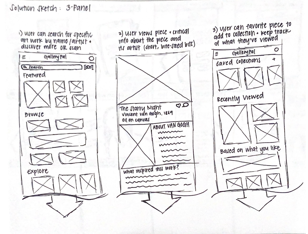
Looking at the screens, I decided that the first sketch would actually serve as the critical screen. Thinking about information hierarchy, I figured this layout would serve as an info screen best with the art piece at the top and the relevant information stacked as the user scrolls down. The solution would thus look like this:
Day 3: Storyboarding
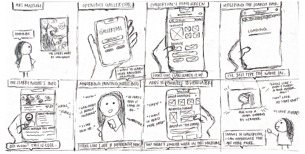
Moving forward with my 3-panel sketch solution, I began to simulate what it could look like if a user was at a museum by themselves in real time and used GalleryPal to find more information about the art piece they were specifically looking at.
Day 4: Designing and Prototyping
Day 5: Validate and Test
I conducted a total of five (5) usability tests with users that had some level of interest in art and enjoy visiting art museums.
Some of the suggestions for improvement included:
be more descriptive by using text captions under or within each image to inform the user as to what they are looking at
improve layout hierarchy by reordering the text sections on the informative screens
redesign the navigation bar by adding color and placing emphasis on the icon that correlates to what screen the user is currently viewing
Reflection
As this was my first sprint experience, it was interesting getting to work against a strict timeline of only 5 days. Because I had to really focus in and delegate how much time I would be devoting to a specific task for each day, my understanding of the importance of timeboxing has grown tremendously. There is always room to reiterate my designs at a later time, but I had to ensure that I was maximizing efficiency by not dwelling too much on the smaller details and only working on the most critical elements that would contribute to the minimum viable product (MVP). Furthermore, this project helped me be a team player, in that I needed to fulfilly my key duty of thoroughly understanding the problem space before jumping into making the designs as the research was not performed by me. Doing this was critical in allowing the sprint to go smoothly.


